Design Process
Research:
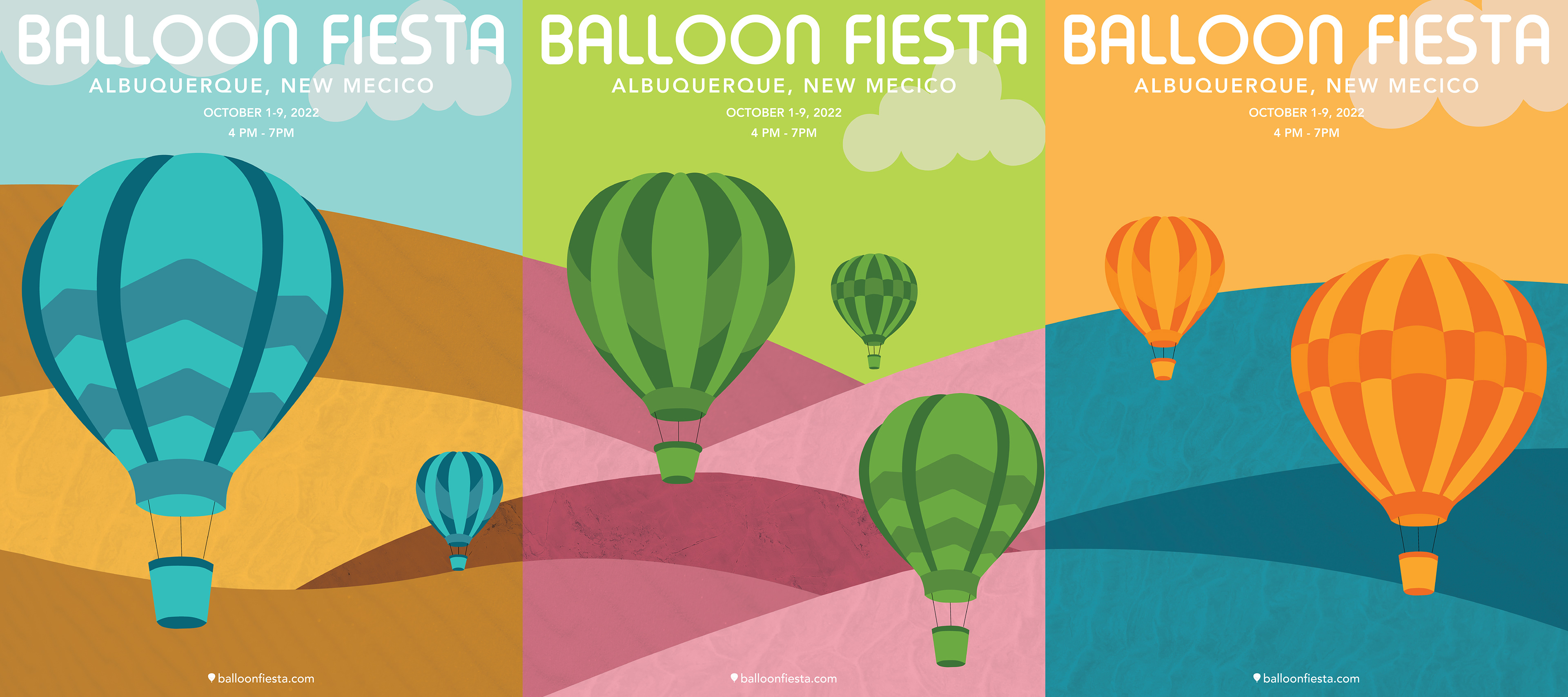
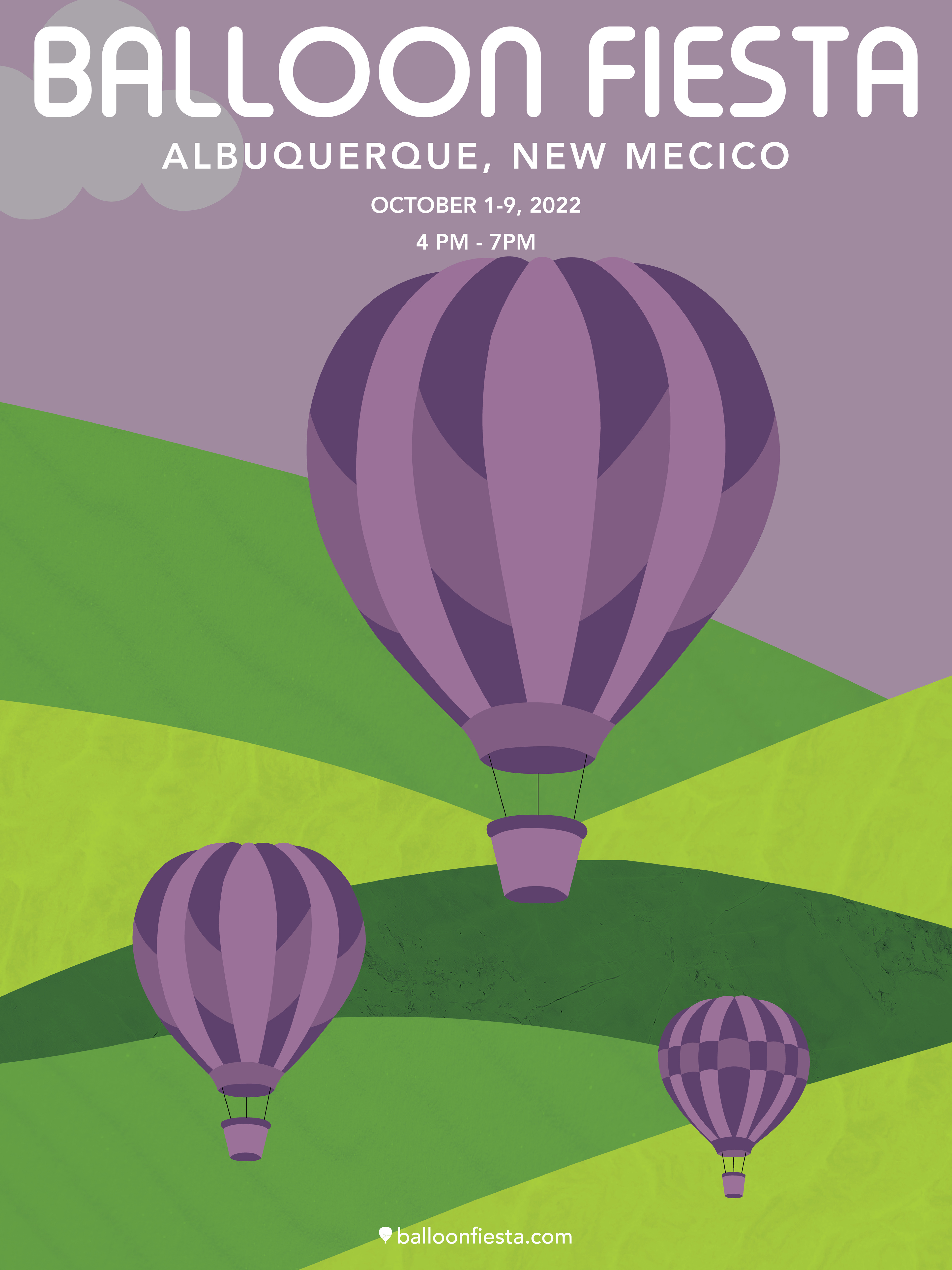
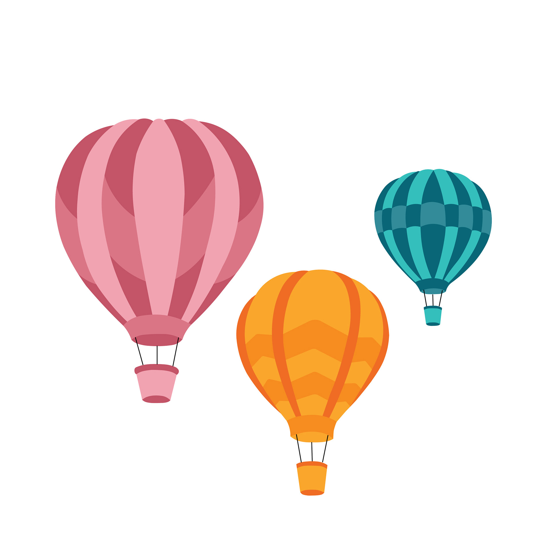
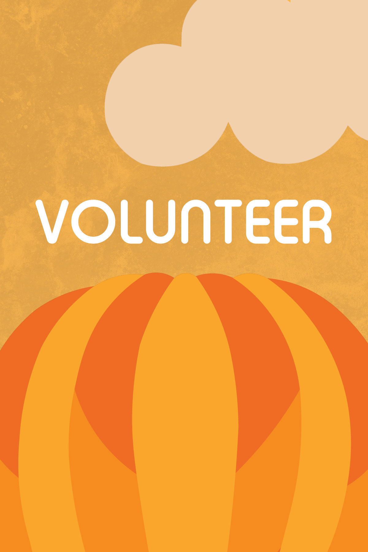
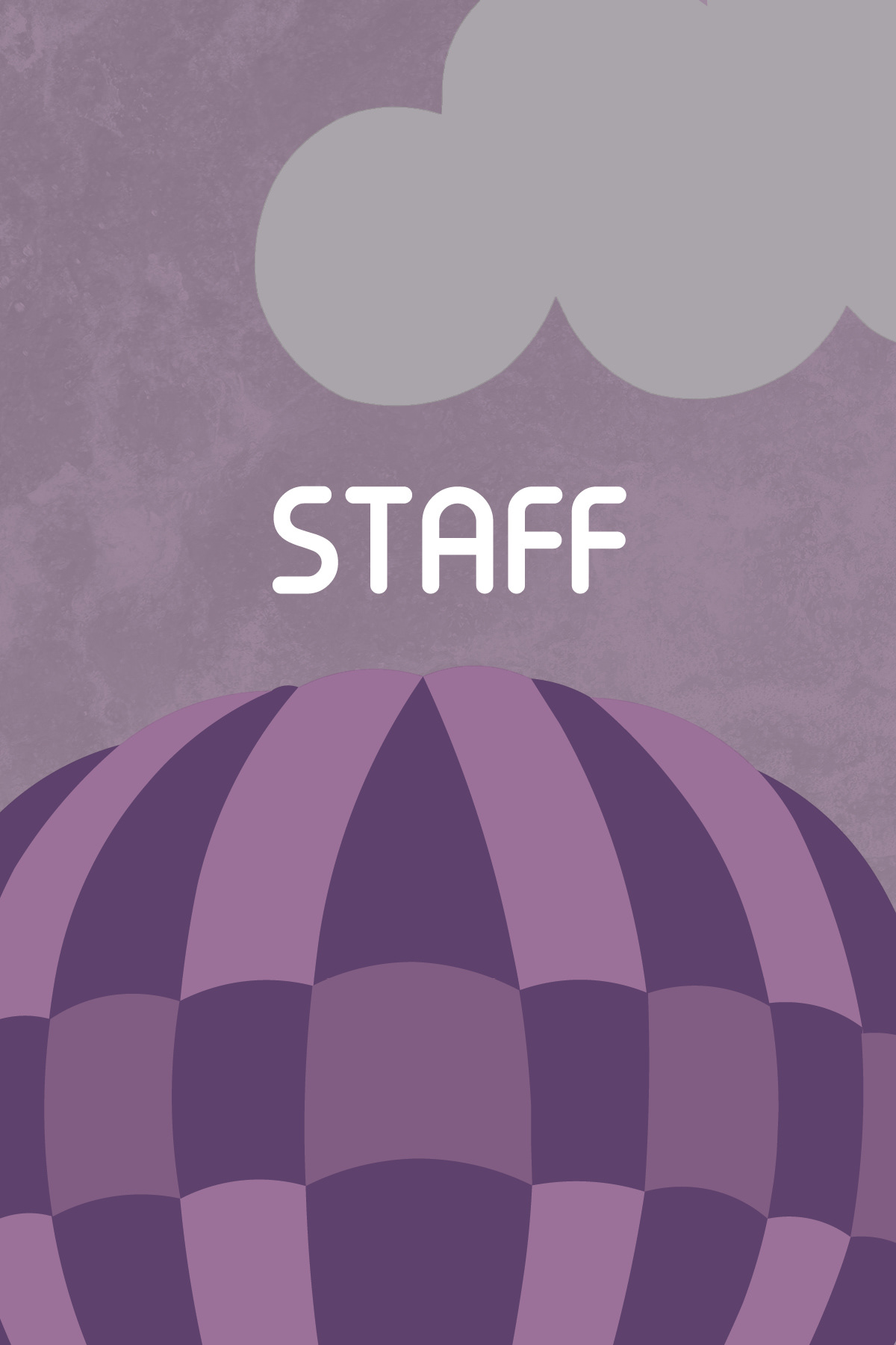
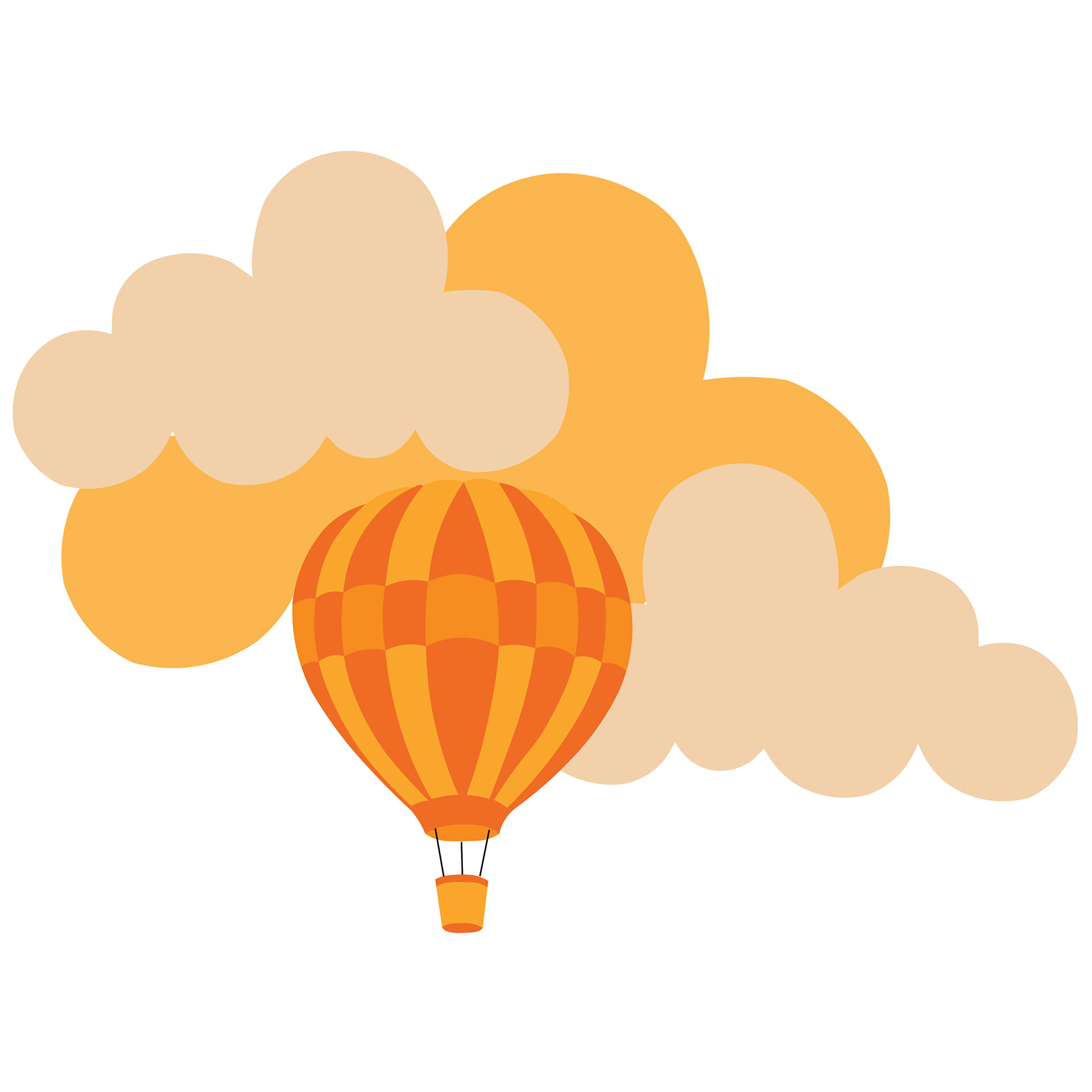
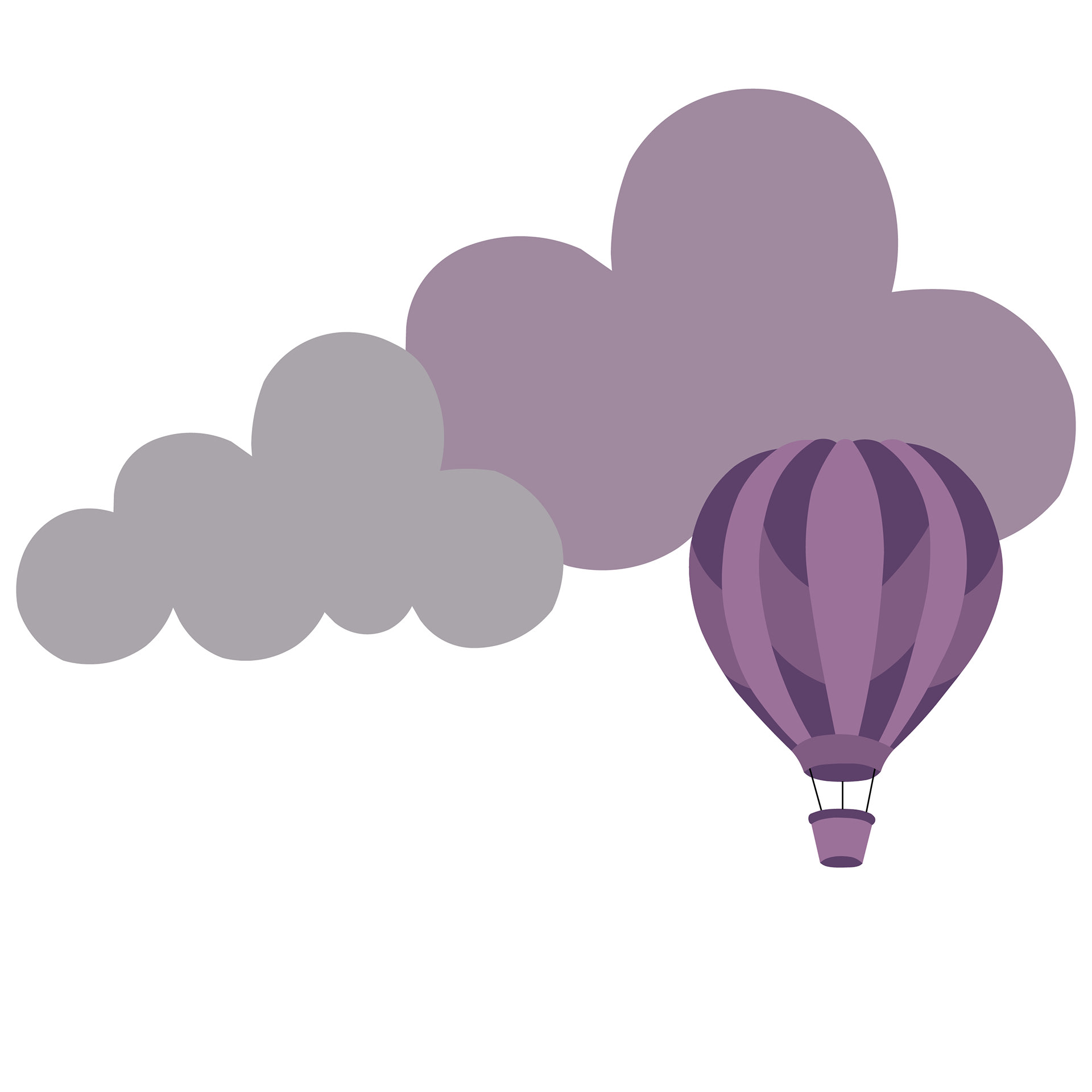
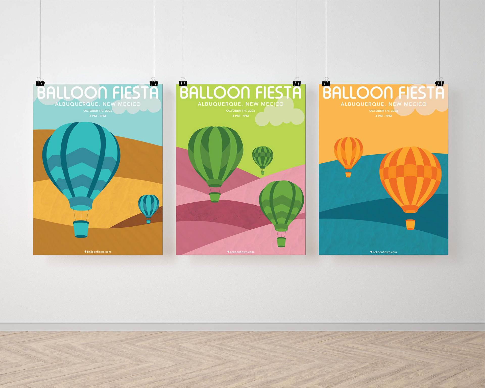
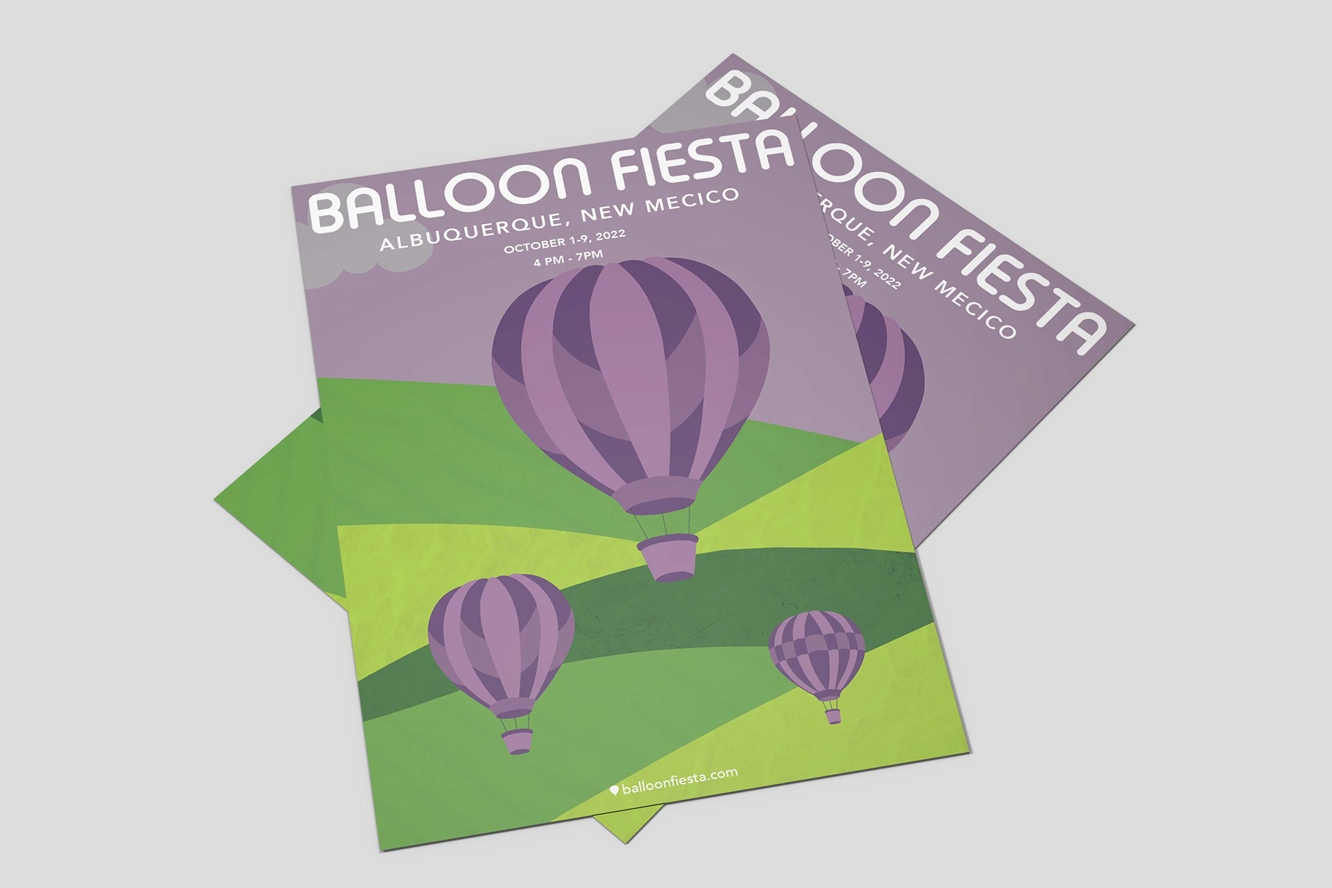
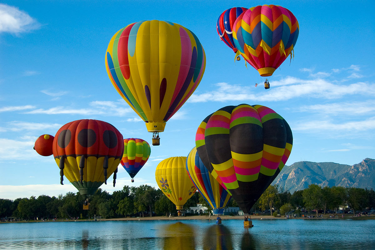
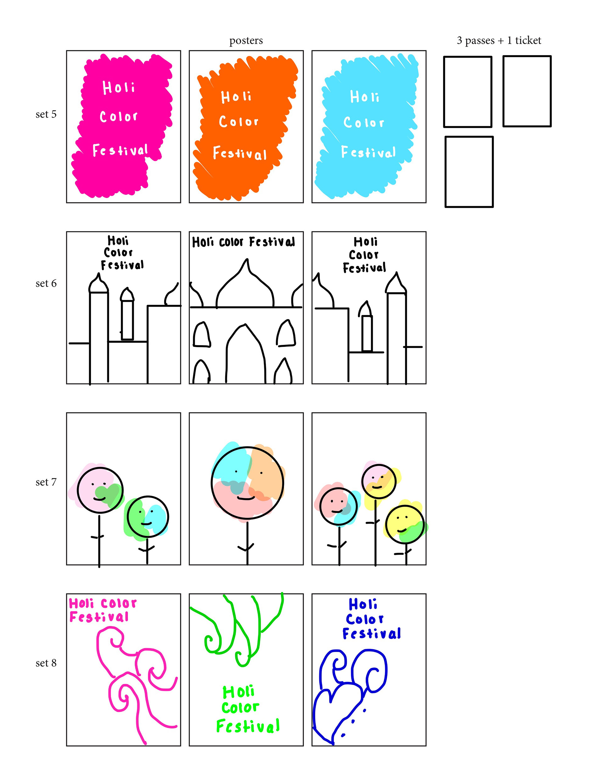
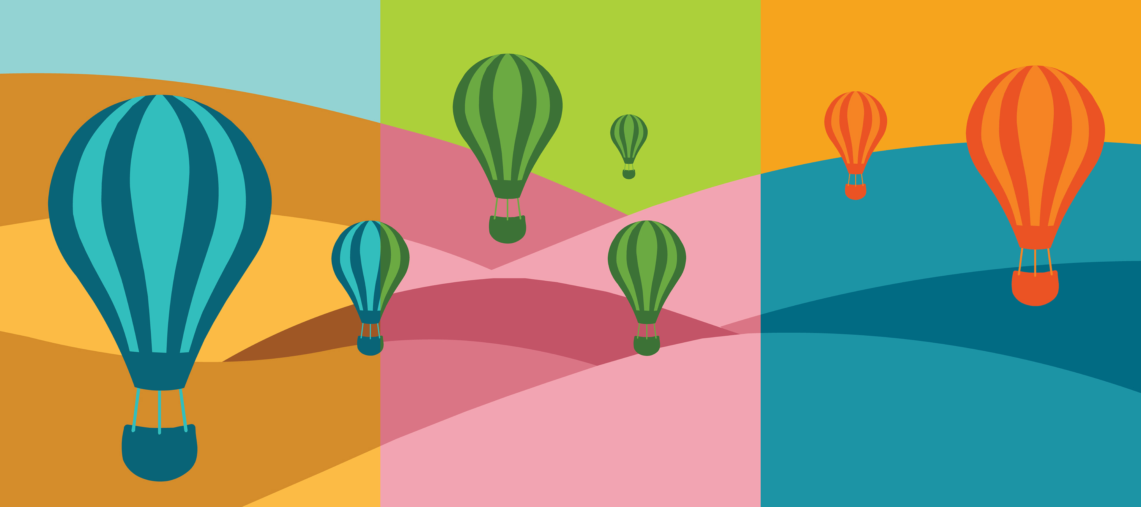
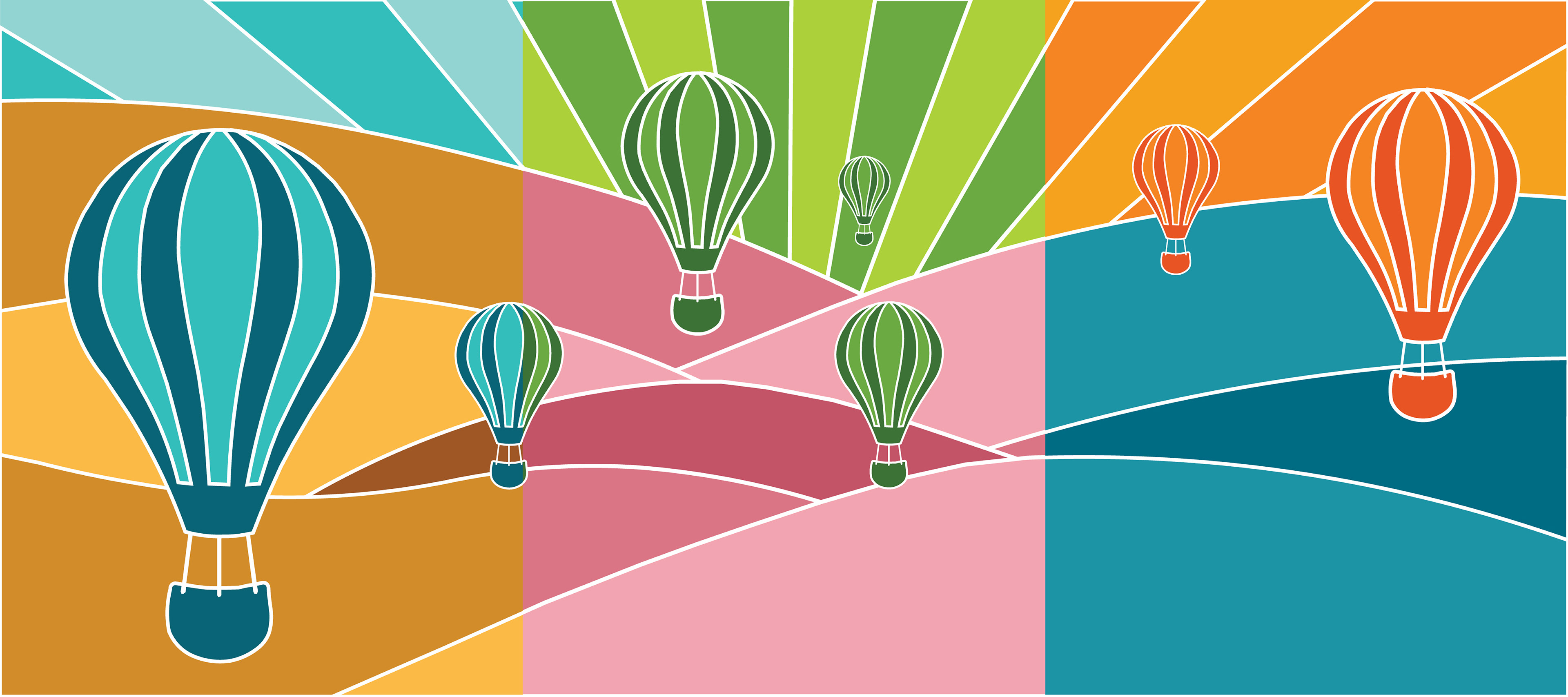
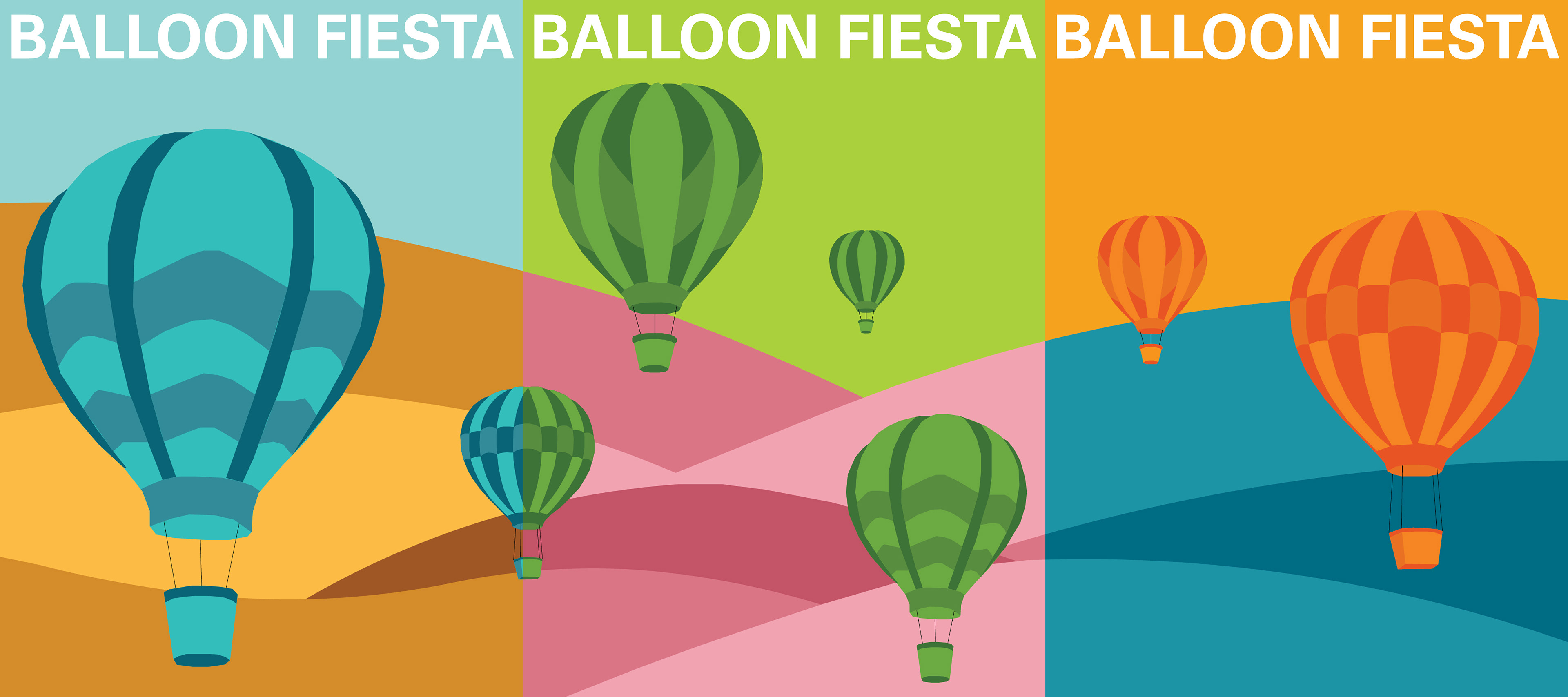
I did a lot of research when it came to picking out the right colors. I was really drawn to the bright and pretty colors that are often associated with hot air balloons, but I also wanted to try and do something a little different. Instead of having multiple colors on the hot air balloon, I decided to use one. I think that that approach actually helped my posters to look less busy.
Thumbnails:
When doing research on this festival, I noticed that a lot of posters seemed to focus on the scenery. For example, the festival takes place in New Mexico, so many of the posters would be an aerial view of the landscape and might include something such as a cactus. I knew for a fact that I wanted to focus on the hot air balloons.
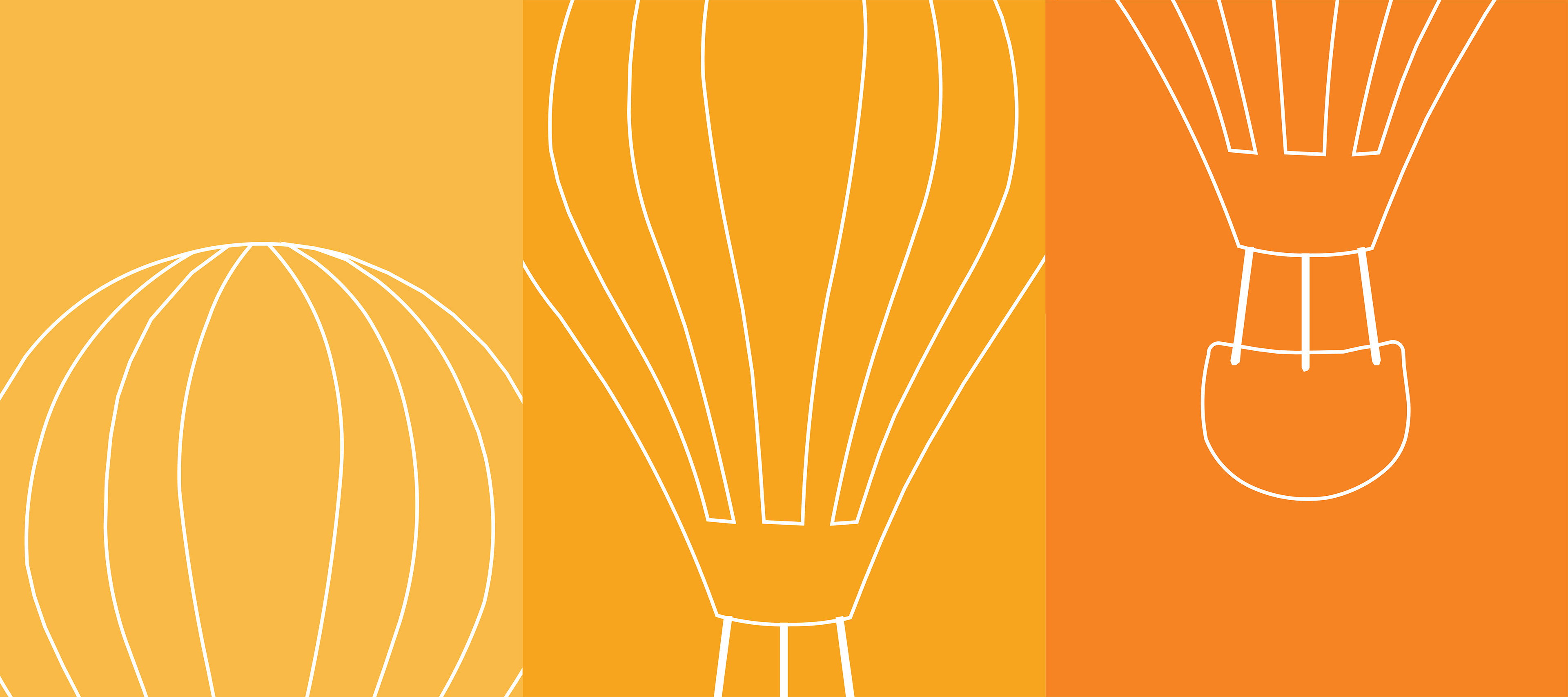
Roughs:
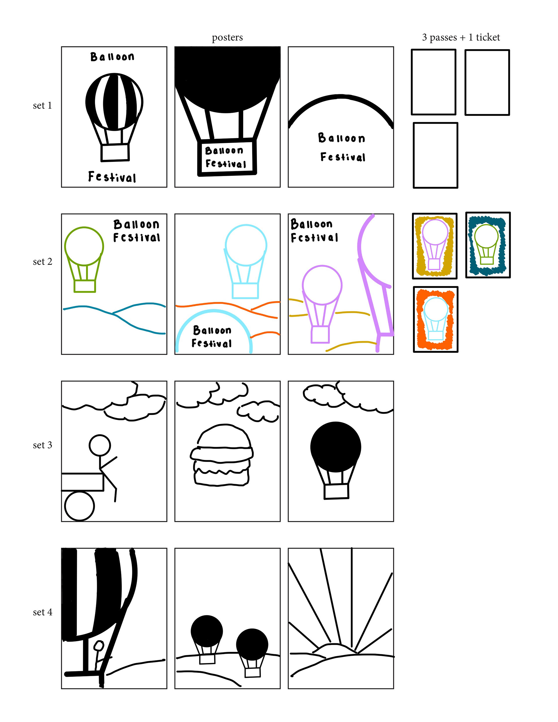
By this point, I pretty much knew what I wanted to do when it came to the colors. I went back and forth between the top two options but after receiving feedback, it seemed like the top choice was the overall better one. I soon began to realize that the white stroke on the second option was going to be a problem once I added type.
Revised Roughs:
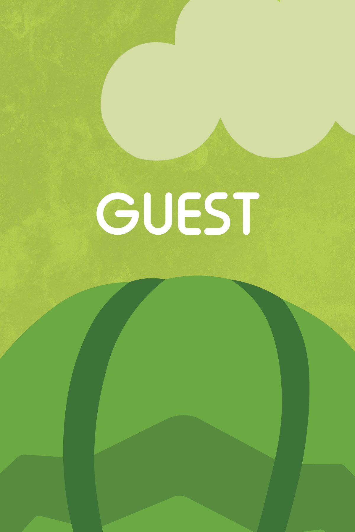
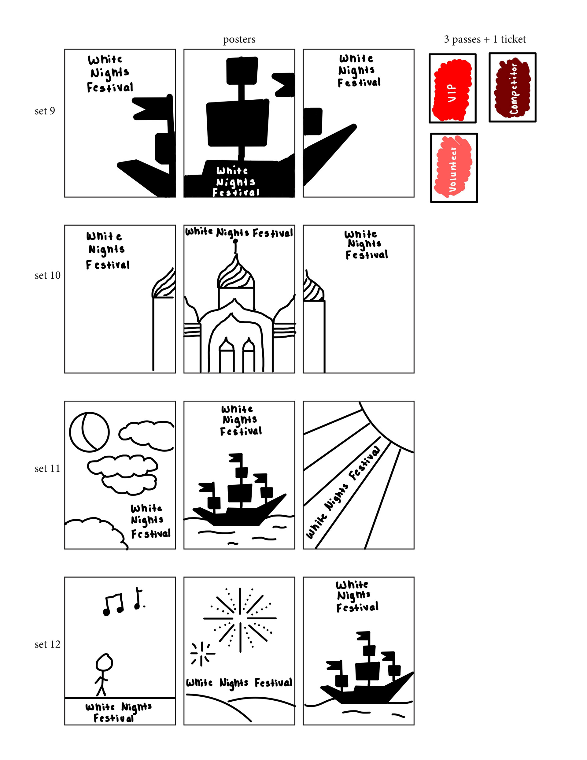
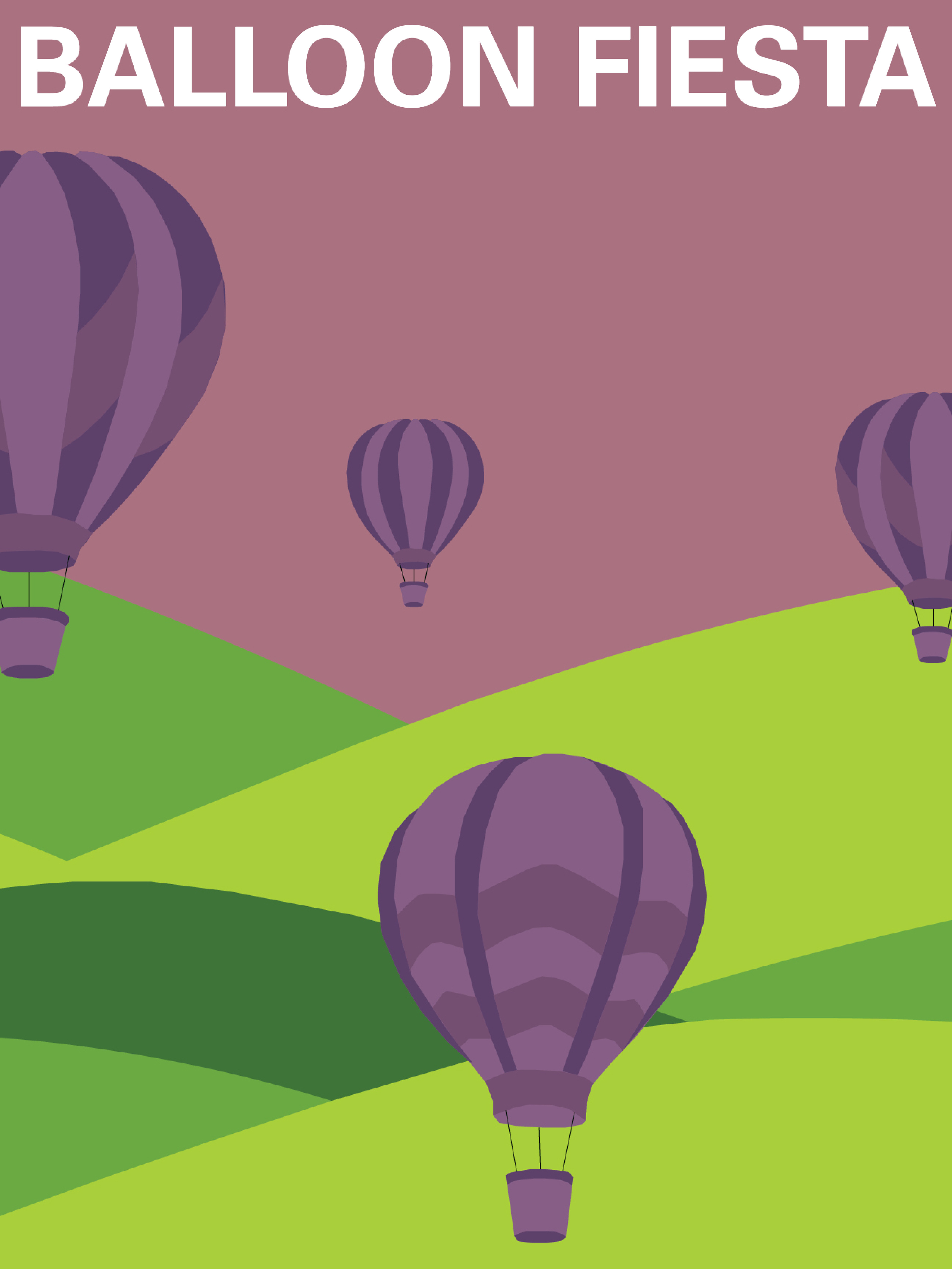
At this point, I fixed my hot air balloons and tweaked the colors a bit. It was at this point that I knew I was getting close to the end. I also made the decision to add clouds which I really think helped with the overall design of the posters.
Tight Roughs:
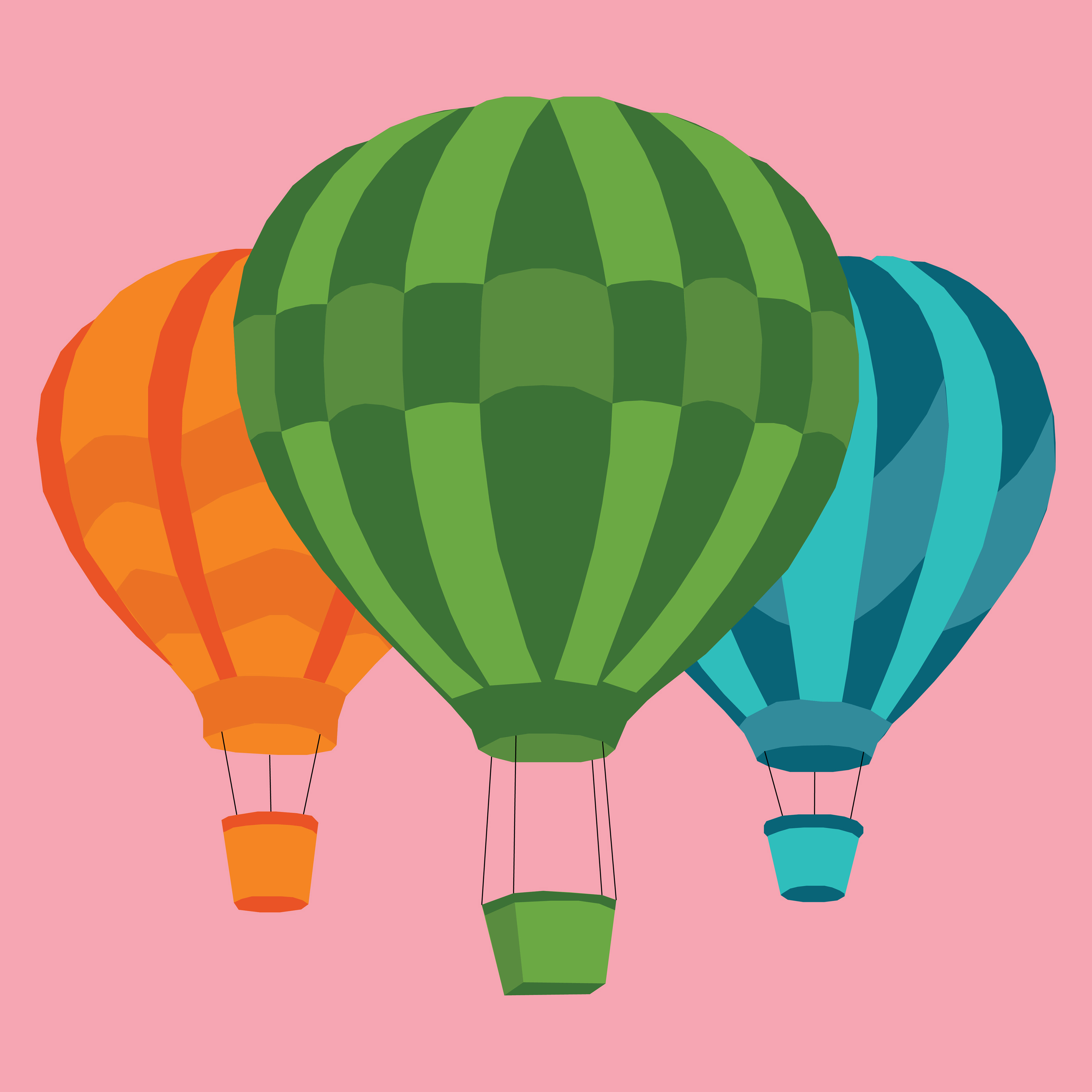
Adding texture to my posters was really something that helped my overall design. It added depth and made them more interesting to look at.
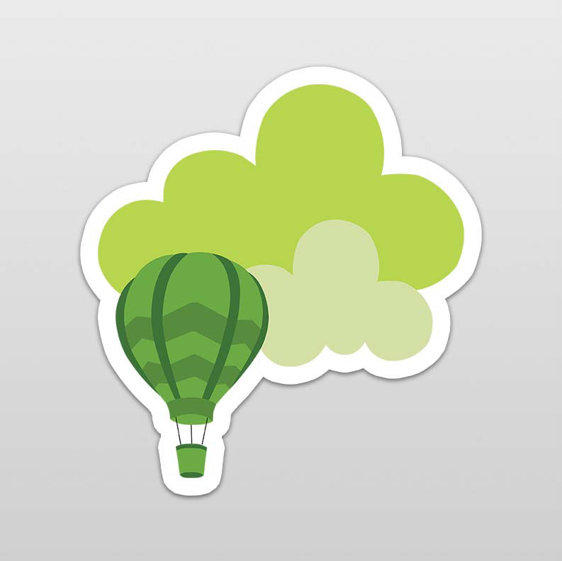
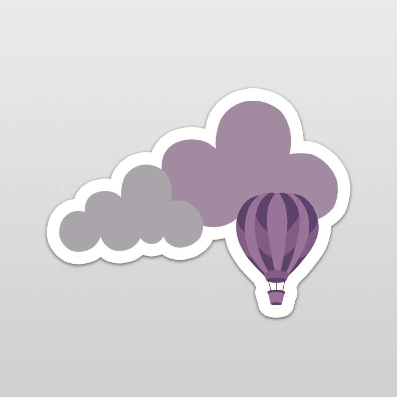
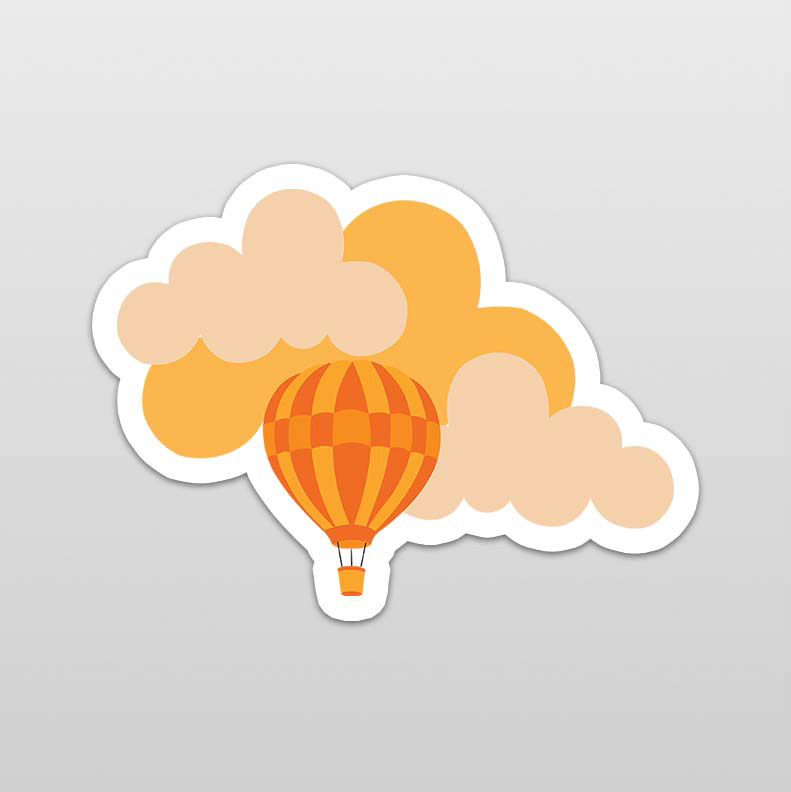
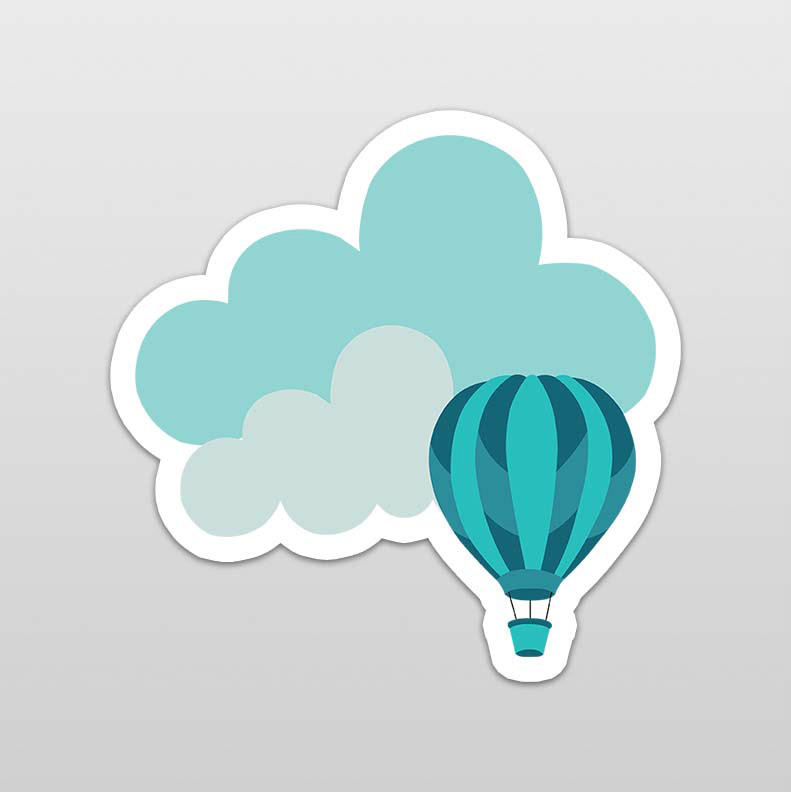
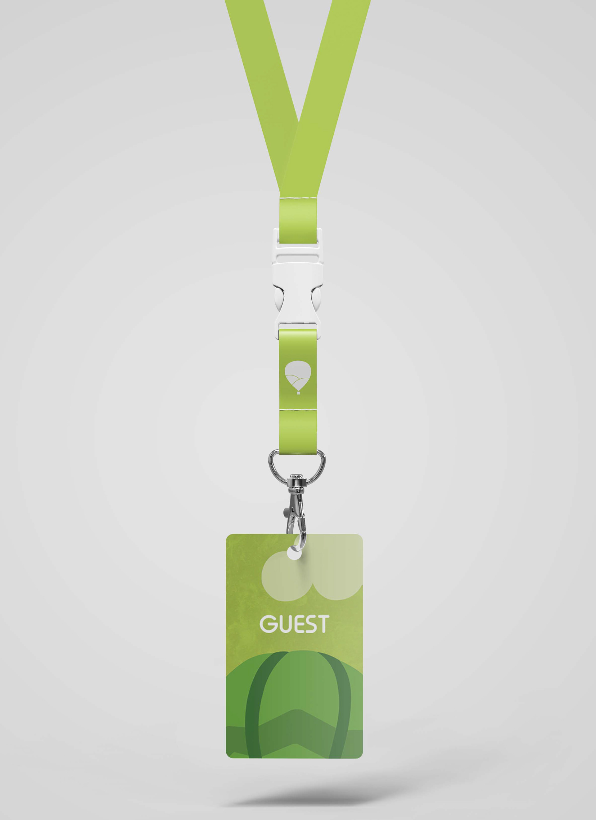
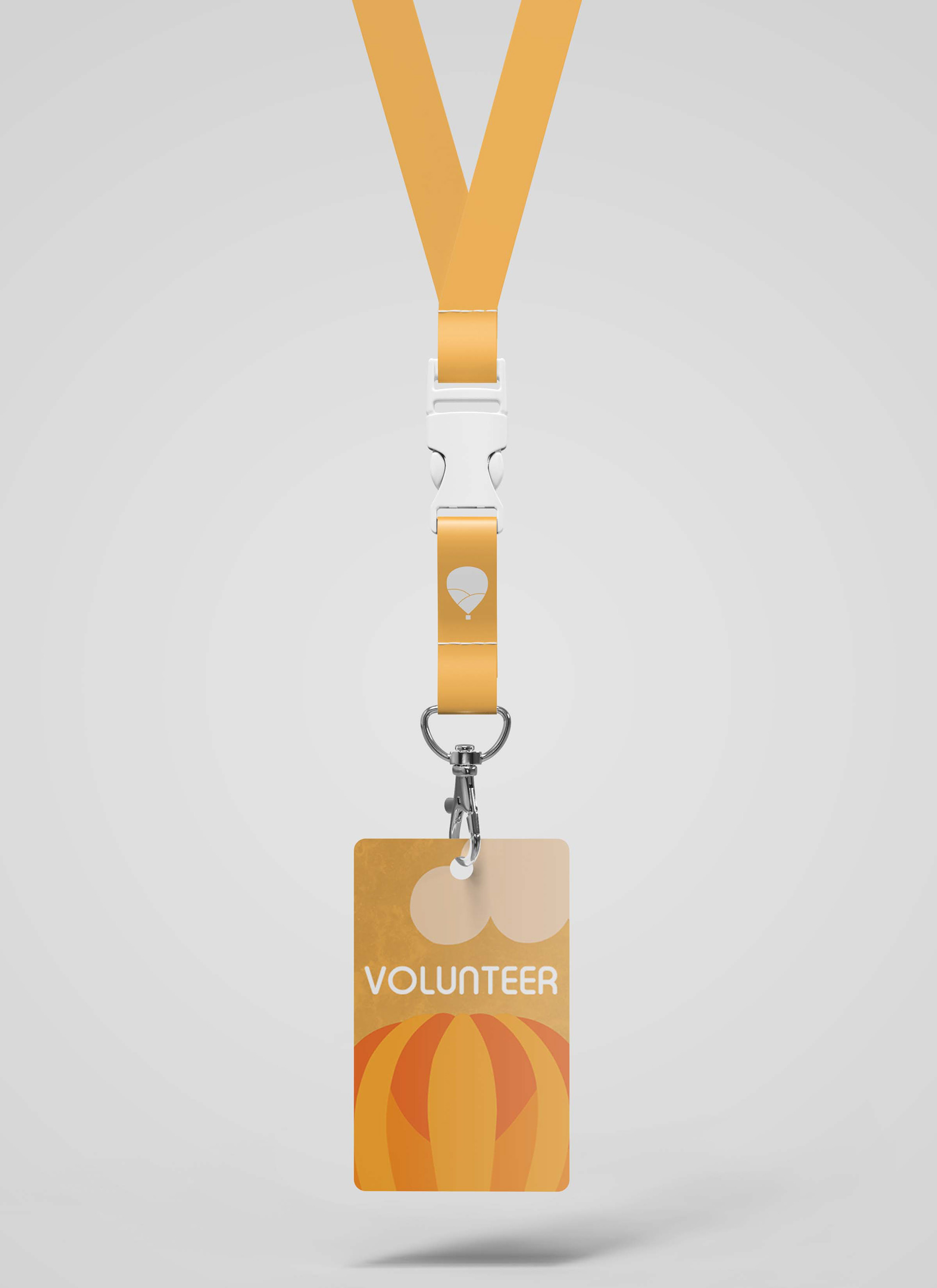
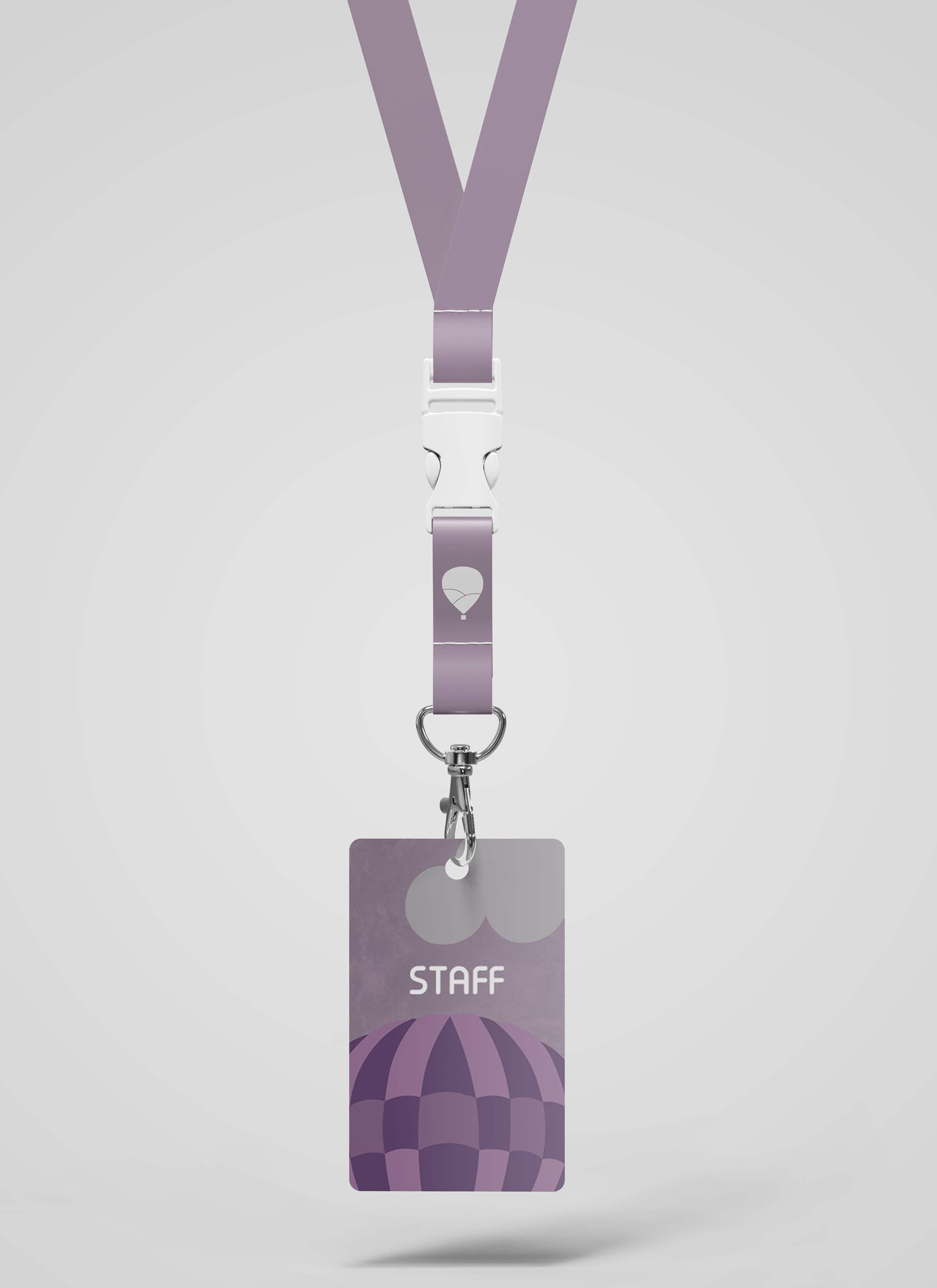
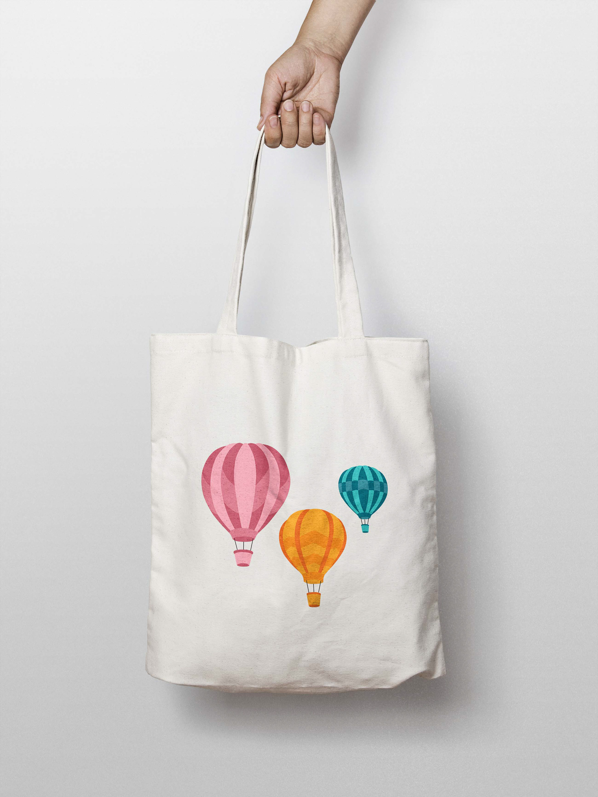
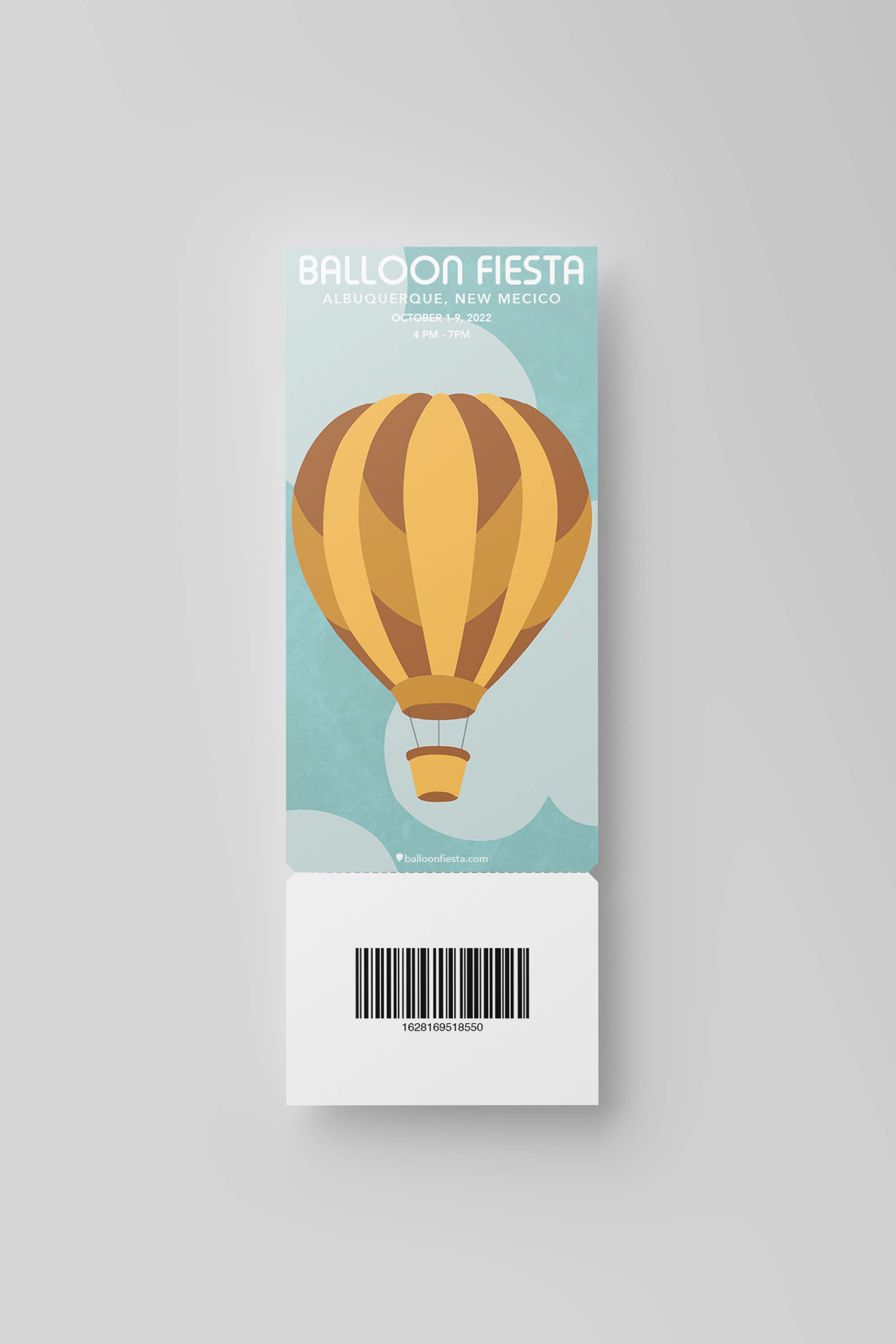
The bag and stickers have a lot of the same elements as the posters. I was able to incorporate clouds on the stickers which really helped clouds to make more sense in my overall design. I decided to add a close-up of one of the hot air balloons on the passes and even added a slight texture in the background.
Finally, I worked on the logo. It’s a very simple design that resembles the shape of a hot air balloon and incorporates the hill within it. I think that this helps to tie it in with the posters. The color choice was also something that was inspired directly by the posters.